Sometimes the internet just decides. No committee. No brand strategy meeting. No focus group. Just chaos, memes, and a little bit of magic.
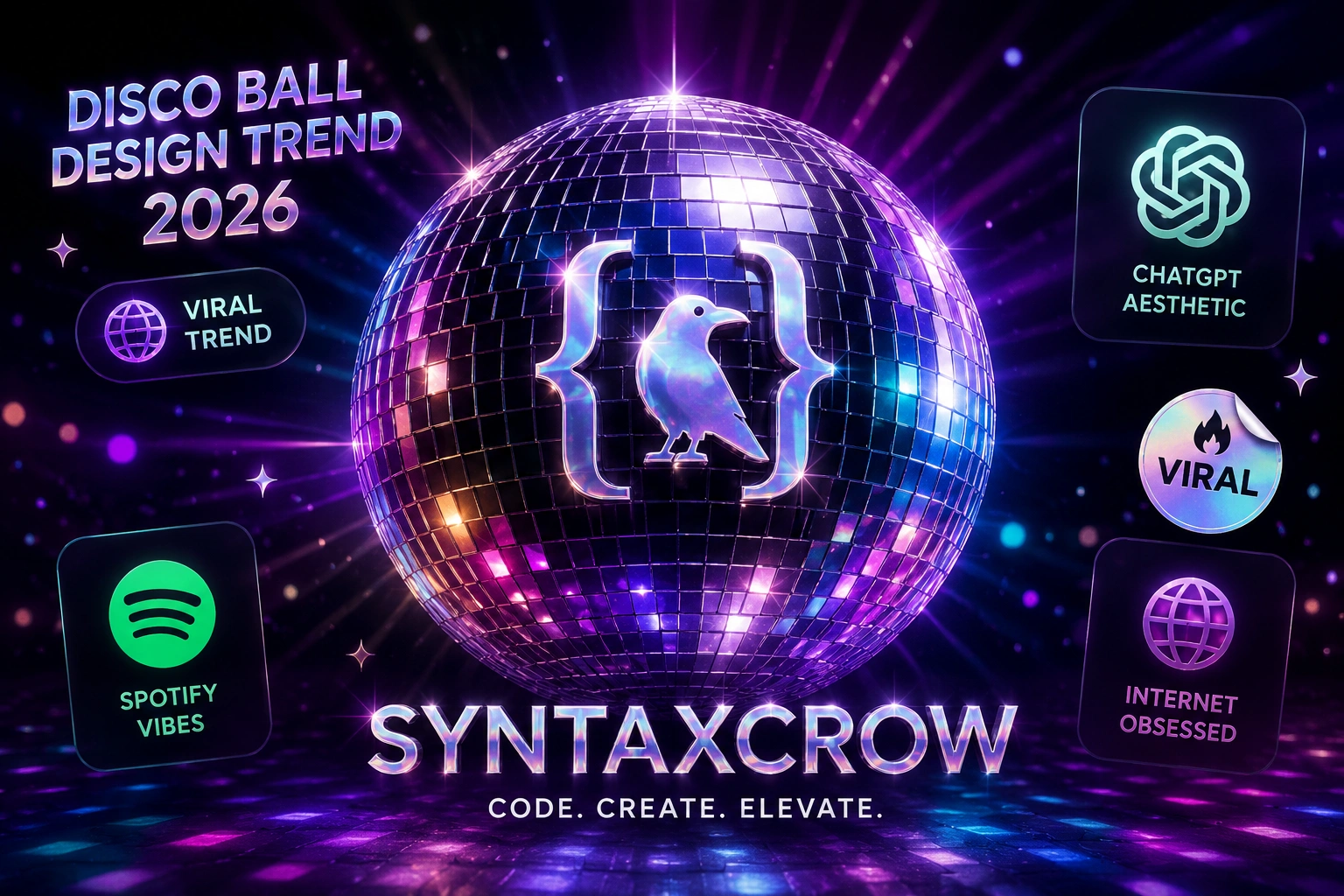
That is exactly what happened on May 14, 2026. Spotify changed its icon to a disco ball for its twentieth anniversary. Users noticed immediately. And they hated it. Then something strange happened. ChatGPT joined in. Then Notion. Then MoonPay. Then Uniswap. Within forty eight hours, a full blown internet meme called "Discomorphism" had over one hundred eighty thousand likes on Instagram.
Designers are confused. Marketers are scrambling. And everyone is asking the same question. What is Discomorphism, why is it everywhere, and is this just a joke or an actual trend?
Let me break down exactly what happened, why it matters, and whether you should jump on the disco ball bandwagon.
What is Discomorphism? The definition nobody asked for
Discomorphism is not a real design term. At least, it was not until last week. The name is a joke. It combines "disco ball" with "skeuomorphism," which is the design style that makes digital objects look like their real world counterparts.
Think old Apple iOS. The notes app looked like a yellow legal pad. The calendar looked like a desk calendar with torn pages. That was skeuomorphism. Then flat design killed it around 2013.
Now the internet has resurrected the idea but with a very specific twist. Instead of leather stitching and paper textures, everything is a disco ball. Reflective. Glittery. Slightly obnoxious. And apparently hilarious.
The trend started as a prank. But when multiple billion dollar companies play along, it stops being a prank and becomes something else entirely.
How the Discomorphism trend started
Let me walk you through the timeline because the speed matters.
May 14, 2026. Spotify turns twenty years old. To celebrate, they swap their iconic green and black logo for a spinning disco ball on the app icon. Social media erupts. Some users think their phone is broken. Others think it is a glitch. A few find it funny.
May 15, 2026. The ChatGPT Twitter account posts a mirror emoji. Then changes their profile picture to a disco ball. No announcement. No explanation. Just the ball. The internet loses its collective mind.
May 16, 2026. Notion follows. Then MoonPay. Then Uniswap. Then a dozen smaller brands. Each changes their logo to a disco ball variant. Each tags the next brand like a chain letter.
May 17, 2026. Someone coins the term "Discomorphism" on Instagram. The post gets one hundred eighty thousand likes in two days. Design publications scramble to write explainers. Google searches for "disco ball logo trend" explode by over five thousand percent.
May 18, 2026. Adobe posts a disco ball version of their red logo. Figma follows. The line between joke and movement disappears entirely.
Why Discomorphism is resonating right now
You might think this is stupid. And honestly, it kind of is. That is exactly the point.
The internet in 2026 is exhausted. AI content floods every feed. Brand marketing feels corporate and soulless. Every logo is a minimalist sans serif wordmark in a neutral color. Everything looks the same.
Discomorphism is rebellion. It is silly. It is analog in a digital world. A disco ball has no place on your phone screen, and that is why people love it.
There is also a nostalgia angle. Disco is having a cultural moment. Beyoncé released a disco influenced album last year. Dua Lipa never stopped. The kids who grew up on 70s samples are now brand managers and designers.
But mostly, it is just fun. The internet forgot how to have fun for a while. Discomorphism is fun.
Skeuomorphism comeback 2026? Not exactly
Design writers are calling this a skeuomorphism comeback. That is not quite right. Skeuomorphism was about making digital interfaces familiar by mimicking physical objects. A trash can icon that looks like a real trash can. A camera shutter sound that mimics a mechanical lens.
Discomorphism is not trying to help you understand how to use an app. It is pure vibes. A disco ball logo does not teach you anything about music streaming or chat interfaces. It just makes you smile.
That said, the broader trend away from ultra flat, ultra boring design is real. Apple has slowly reintroduced shadows and depth into their interfaces. Microsoft added more personality to Windows. Even Google's Material Design has evolved past pure flat rectangles.
Discomorphism is the loud, funny, glittery cousin of that broader shift. Do not expect your banking app to add a disco ball. But do expect more brands to take risks with their visual identity.
The brands that joined the Discomorphism movement
Let me list who played along and how.
Spotify started it. Their disco ball logo spins when you open the app. On the anniversary day, tapping the ball played "I Will Survive." The detail made people laugh instead of complain.
ChatGPT did the quiet cool version. Just a mirror ball profile photo. No text. No hashtags. The mystery drove engagement higher than any announcement would have.
Notion went all in. Their disco ball includes tiny product icons reflected on the surface. Design nerds spent hours analyzing the reflections. That is free marketing.
MoonPay and Uniswap joined from crypto world. Their versions include subtle Web3 references. A disco ball with crypto tickers reflected. Very niche. Very online.
Adobe and Figma followed from the design tools space. This matters because they are signaling that Discomorphism is not just a meme. It is design community inside baseball now.
Smaller brands jumped in too. A taco shop in Austin changed their Instagram profile to a disco ball taco. A dental practice posted a disco ball tooth. The creativity is the point.
What this means for branding in 2026
If you run marketing or design for a brand, you are probably wondering whether to join. Let me give you honest advice.
Joining a trend that moves this fast is risky. By the time you get approval from legal, the moment has passed. Discomorphism might be forgotten by next week. Or it might define visual identity for the next year. Nobody knows.
Forbes covered similar brand meme moments in the past. The ones that work feel authentic and fast. The ones that fail feel desperate and slow.
If you want to participate, here is a better approach. Do not change your official logo everywhere. That is a nightmare for brand tracking. Instead, do what Spotify did. A temporary, clearly labeled anniversary or celebration version. Add a tooltip that says "we are being silly for a day." Users appreciate the honesty.
Also consider the platform. Discomorphism is an internet native trend. It lives on Instagram, X (Twitter), and TikTok. Your email signature probably does not need a disco ball. Neither does your packaging or your physical store signage.
Keep the joke where the joke lives. Online. Fast. Disposable.
The psychology behind viral design trends
Discomorphism works for the same reason any meme works. Participation is low effort and high reward. Changing a profile picture takes ten seconds. Posting about it takes thirty seconds. Feeling like you are part of an inside joke is priceless.
The trend also has a villain. Minimalist corporate design. Every startup logo looks the same. Every app icon is a bland gradient. Discomorphism is the chaotic good response to boring.
Harvard Business Review has written about how brands build loyalty through shared cultural moments. Discomorphism is exactly that. It is not a product feature. It is not a pricing advantage. It is a feeling of being in on something together.
That feeling is harder to copy than any logo or tagline.
Should you actually use Discomorphism for your brand?
Let me give you a clear yes or no.
Yes if you have an internet native audience who appreciates humor. Yes if you can move fast and get approval in hours, not weeks. Yes if you are willing to change back when the moment ends.
No if you are a bank, a healthcare provider, a government agency, or any brand where trust and seriousness are your primary values. No if your legal team needs five signatures for a social media post. No if you cannot laugh at yourself when people make fun of you.
The brands that win with Discomorphism are the ones who commit to the bit. Half measures look sad. A disco ball logo with a corporate press release explaining the "strategic rationale" is the opposite of fun.
Just change the picture. Say nothing. Or say something silly. Let the internet decide.
Where Discomorphism goes from here
Trends like this have three possible endings.
First, it fades. Everyone gets bored. Next week something else happens. The disco balls disappear. Nobody mentions it again. This is the most likely outcome.
Second, it evolves. Discomorphism becomes a real design approach. Brands start adding reflective, glossy, celebratory elements intentionally. The joke becomes a style. Skeuomorphism 2.0.
Third, it ossifies. Disco ball logos become the new minimalist logo. Every brand does it. Then everyone hates it. Then a new trend emerges to rebel against disco balls. The cycle continues.
My guess is the first option. Discomorphism is a moment, not a movement. But moments matter. They remind us that design does not have to be serious. Brands do not have to be boring. And sometimes, a disco ball is exactly what the internet needs.
Final thoughts on the disco ball logo trend
Discomorphism is not going to win any design awards. It will not be in textbooks next to Bauhaus or Swiss Style. But it might be the most human thing brands have done all year.
In a world of AI generated everything, a silly disco ball logo made by actual humans for an actual birthday is refreshing. It says we are here. We are real. And we know how to have fun.
Whether you join the trend or just watch from the sidelines, pay attention to why it worked. Speed. Authenticity. Low stakes. Shared laughter.
Those ingredients work for any brand. Disco ball optional.